Case Matematikfessor
Finalizing Matematik-fessor for Relaunch
Background
Matematikfessor is Denmark’s leading math training platform that enables teachers to easily assign and manage homework while evaluating both class and individual student performance, allowing them to quickly address students’ challenges and prepare for parent-teacher conferences.
Students can easily track their homework, get help from Fessor, and learn at their own pace through adaptive training that dynamically adjusts to their skill levels. Launched in 2010, Matematikfessor quickly became the preferred platform for schools nationwide, and the character Fessor became somewhat of a superstar in Danish schools.
My contribution
- Led the overhaul and restructuring of the UI kit and project files, ensuring scalability across the entire ecosystem.
- Redesigned and restructured core features such as assignments and training, while creating comprehensive documentation and flow maps.
- Led the design of the front page and integrated marketing elements.
- Explored AI tools as a means for editors to generate on-brand illustrative material.
- Served as UI design lead for the upcoming evaluation system.
- Assisted with user interviews, workshops, and class observations to inform and validate design decisions.
Challenges
After 14 years with feature optimization, patches and concept changes, Matematikfessor was in a dire need of a redesign. The transition was well underway and now faced a finite launch date set within 12 months. The team had rebuild the platform’s core features and fine-tuned the mathematical models, the redesign process had begun. However, the platform was still in its early beta stage and missing a lot of the previous features and QOL elements the teachers was used to at the legacy platform
Objectives
The objective was to get the new version of MF ready for launch by the new school year, This involved restructuring and polishing the UI kit to establish a more cohesive and scalable design system, as well as streamlining the design processes through an organized Figma workflow. Additionally, existing features needed refinement based on user testing, and new functionalities had to be developed to meet the expectations set by the legacy system.
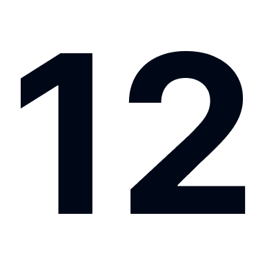
Months to optimize and prepare MF beta for launch
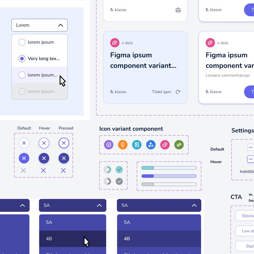
Design overhaul and restructuring of the entire UI-kit and project files
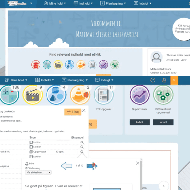
Porting and adapting feature from legacy to the new platform
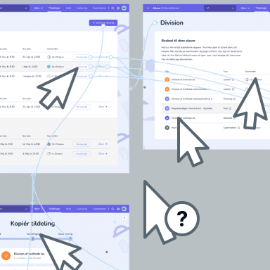
Testing and ensuring the platform is on pair with users expectations


Interviews and Class Observations as the Backbone
User insights were central to our process. We leveraged previous UX reports and regularly conducted internal tests with editors, stakeholders and marketing team members, many of whom were former teachers. as well as conducted class observations to see how the platform performed in a real world scenario.
Midway through the project, we initiated a comprehensive “happy path” user test of the entire platform, which included interviewing teachers on an extensive range of hypothesis backed up with a click-through surveys involving close to 200 students. The heat maps and feedback collected provided insights that we used to optimize existing features and flows, identifying user pain points and adjusted our production pipeline to meet users expectations
When time came to redesign the evaluation feature of the platform, we ran another series of interviews using a high-fidelity prototype to validate our concepts before we embarked into visual design.
Key takeaway from our tests
- Navigation across the platform was intuitive and straightforward.
The new visual design excited participants, but there was room for - improvement, which resulting in the design overhaul of core features.
- Users found it easy to create and manage homework.
- We identified challenges with search functionality that require further optimization.
- Students found it easy to find homework, start training and get help.
UX copy needed an overhaul. - Feature requests were identified and prioritized in our development pipeline.
- Evaluation was found inadequate and later became a key project.
UI-kit Overhaul and Organizing Design Files
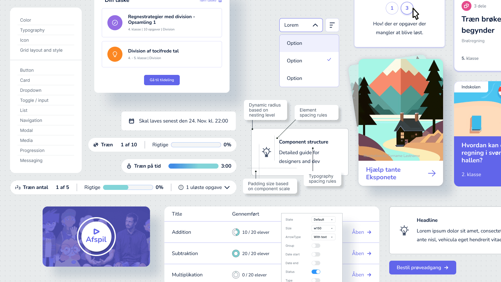
When I joined the project, it needed a clear structure and consistency. To address this, our team reviewed the UI kit and project files to identify critical pitfalls and build a collective strategy for the overhaul. At the top of the list was restructuring the UI kit and ensuring that the components followed industry standards and adapted to a component build-template, using variants and overrides to make them flexible, consistent, and easy to use.
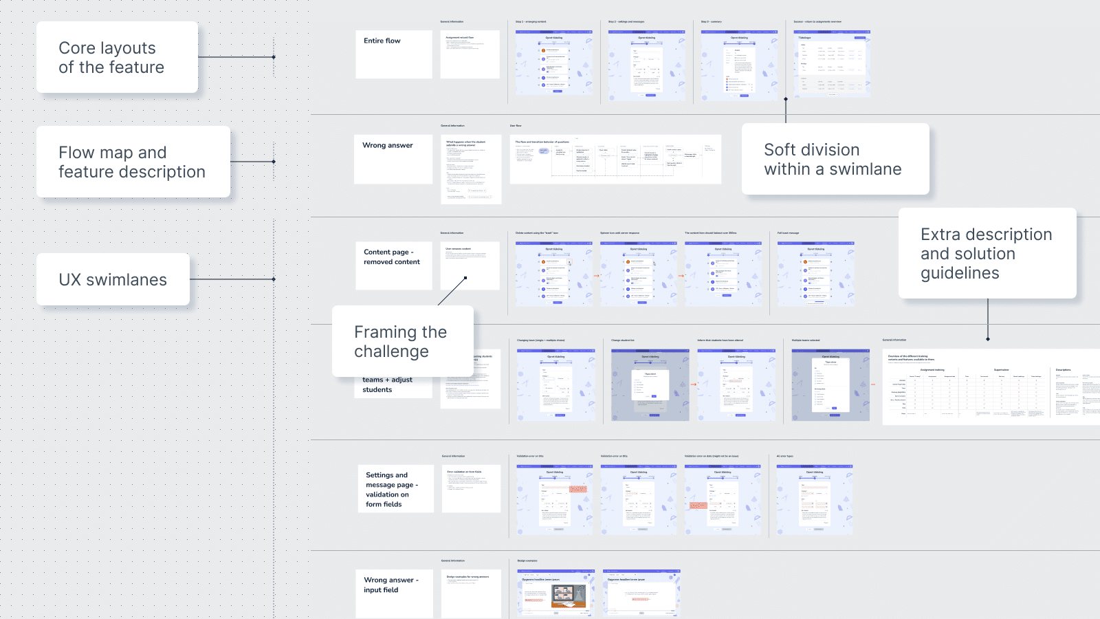
Each feature had its own project file, which was necessary to ensure the flexibility to address as many UX concerns as possible without cluttering the entire ecosystem. Each file was divided into swimlanes addressing visual design, individual UX questions and functionalities. I rebuilt the core feature files to align with the feature’s current state, updated all components and layouts, merged local components into the UI kit, and rewrote and polished the documentation for all swimlanes, transforming brainstorming files into organized resources.
Ensuring the team is up-to-date on changes
To keep the team aligned, I proposed an approval board where designers voted on updates and design changes. This approach ensured everyone was informed and fostered collective ownership of the project, while providing developers with a single source of truth for their work.
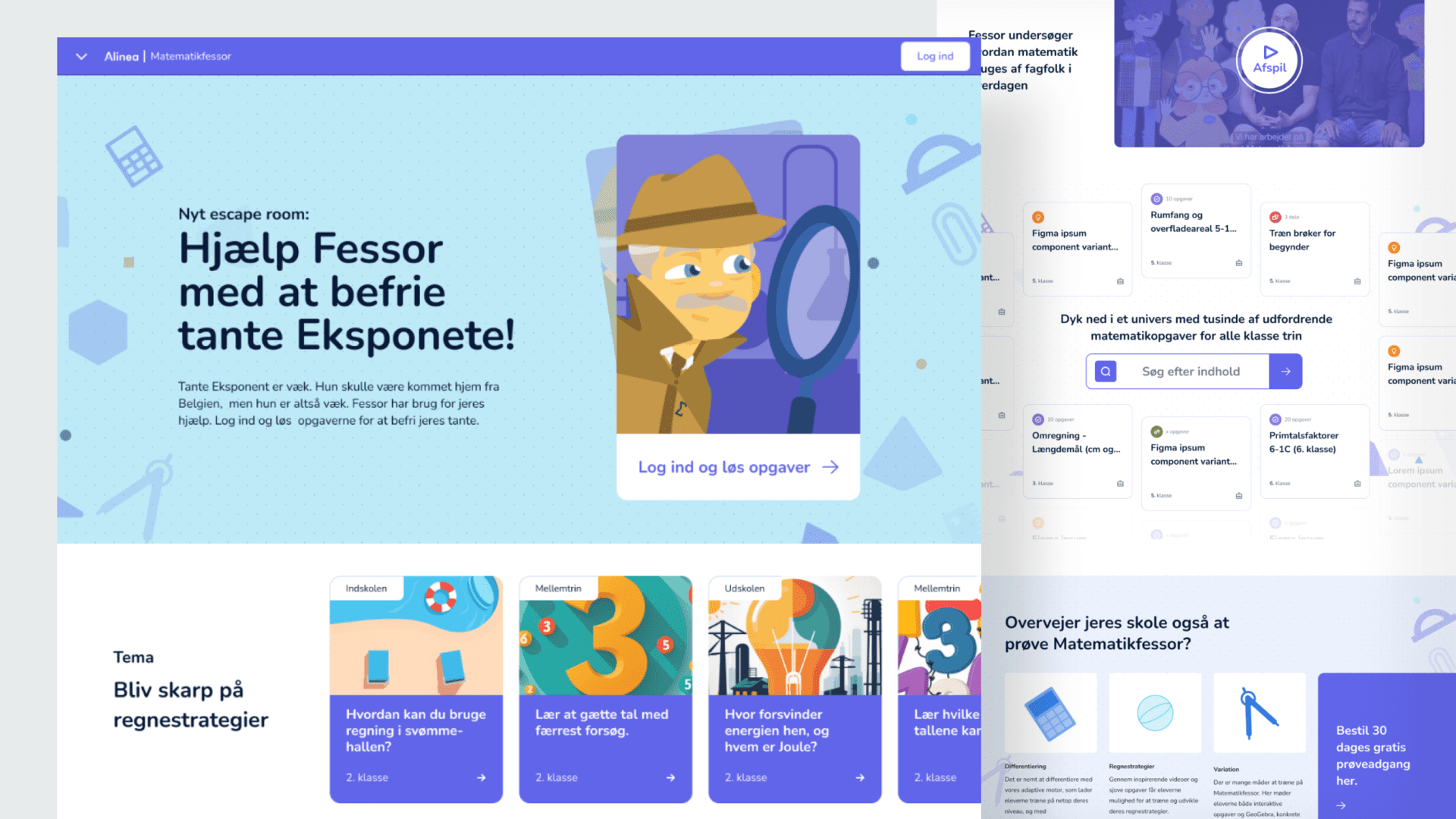
Front Page design and Marketing Integration
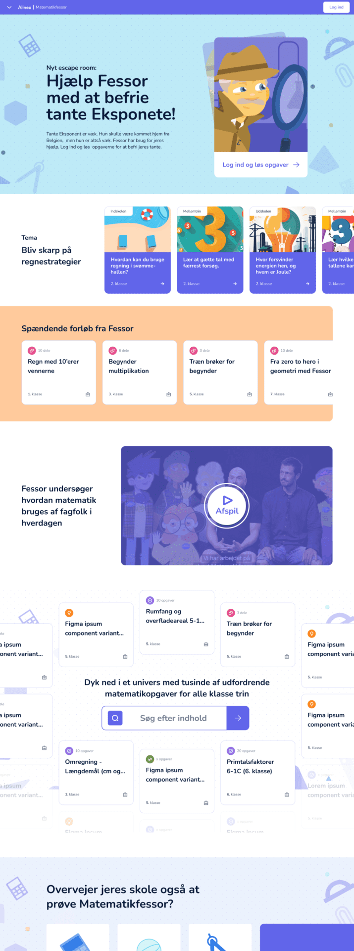
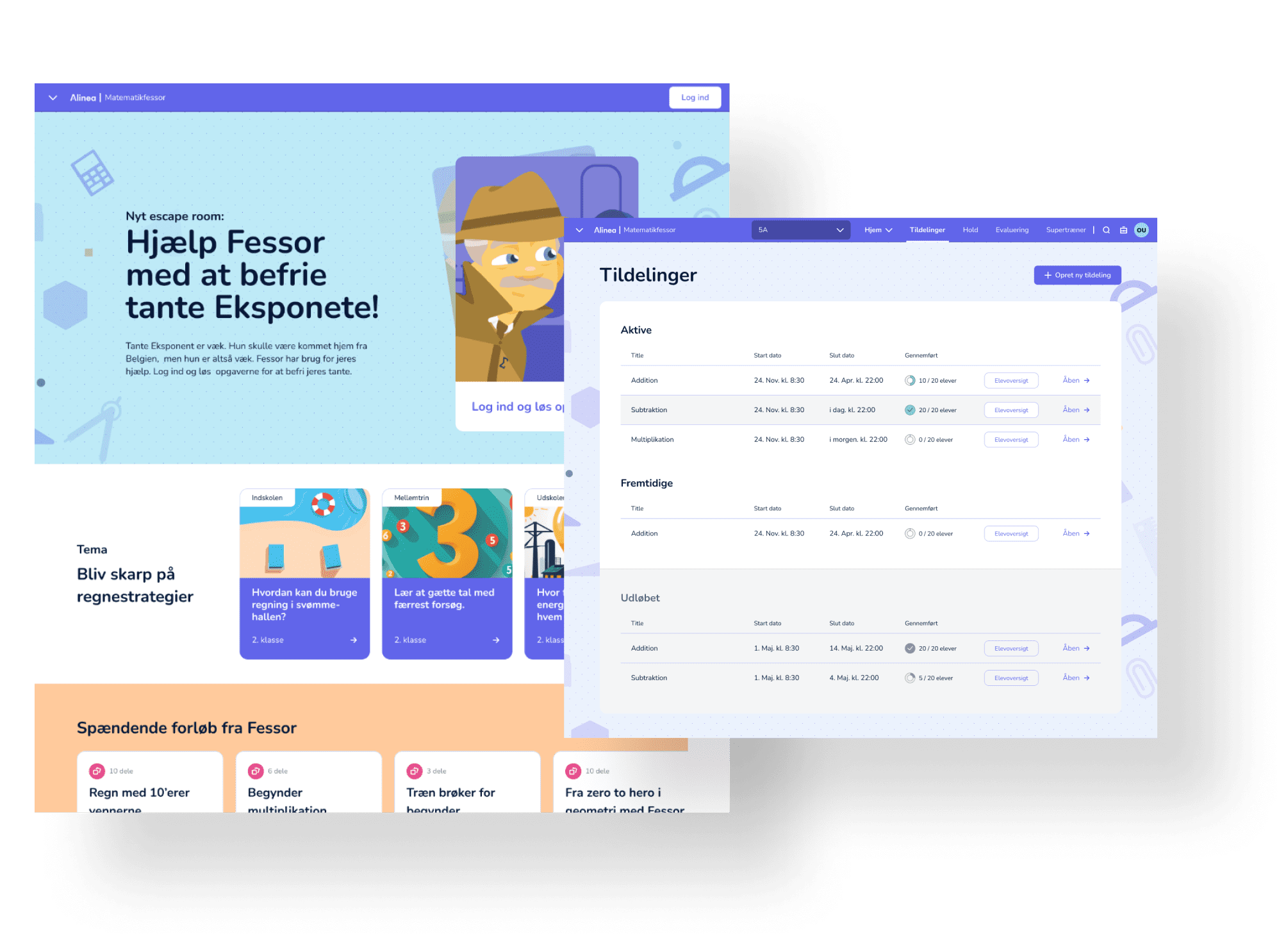
I led the design of the front page for Matematikfessor, using stakeholder interviews and journey mapping based on three key personas: the teacher, the student, and the decision-maker. The main focus of the front page was to inspire teachers with platform content while bridging the brand gap between the main brand and Matematikfessor, the front page should feel like a natural extension of the tool rather than a traditional product cover page. None members and decision-makers would be nudged towards dedicated product pages and signup flows.
The front page was designed to change monthly and built from a range of modular components managed through the CMS. To understand editorial needs, we invited stakeholders and editors to a workshop where groups collaboratively built and discussed front page layouts using printouts of planned content sections. This exercise helped balance the content and revealed new areas of interest.
To create a seamless experience for teachers, the front page linked directly to content within the platform, mirroring the structure they were familiar with. Using a normal sign-in, teachers would land on a dashboard that featured many of the same promotions from the front page, ensuring they wouldn’t need to revisit it to stay informed.
Tools and methods
- Interviewing stakeholders and the marketing team.
- Using journey maps to identify pain points for teachers, students and decision maker.
- Conducting internal research with dev teams ensuring the design is interlinked with the CMS backend, login flows, and frontend requirements.
- Creating a soft brand analysis to address concerns about bridging the gap between the main brand Alinea and Matematikfessor.
- Co-running a front-page workshop for stakeholders and marketing team.
- Designing a wide range of content sections based on editors needs.
- Supporting dev with extensive documentation.
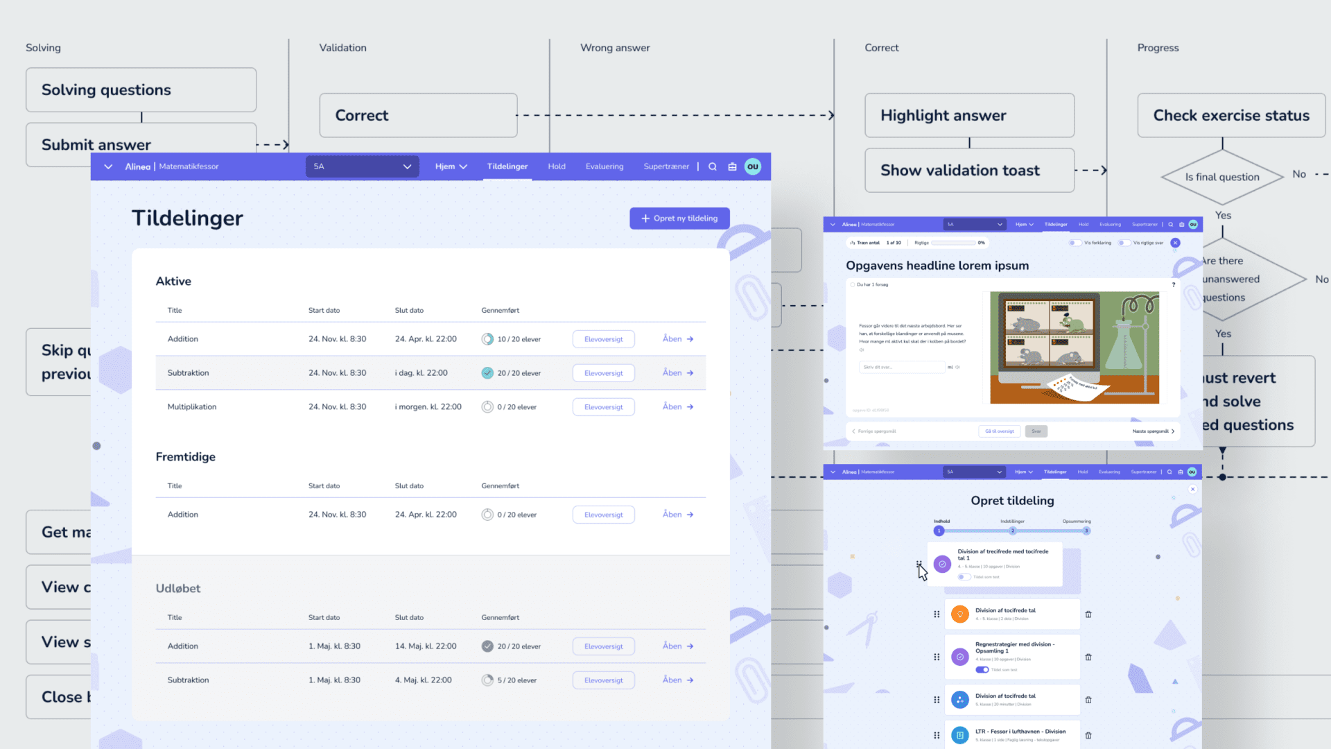
Optimizing and Documenting Assignments and Training
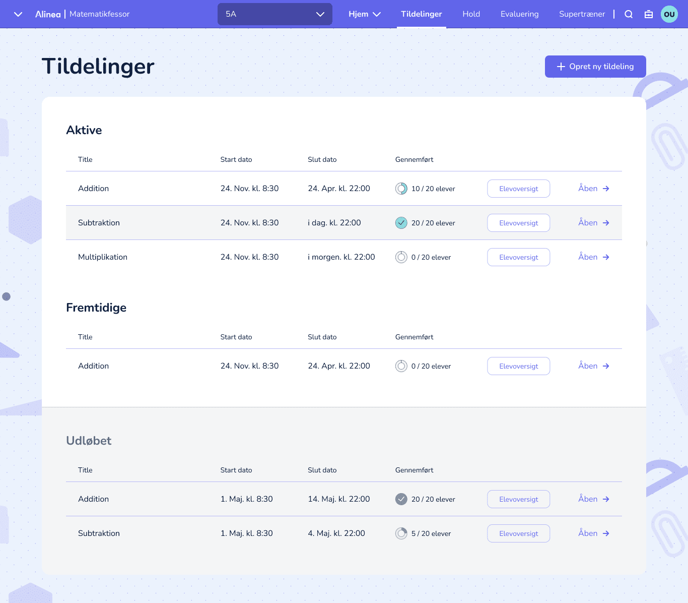
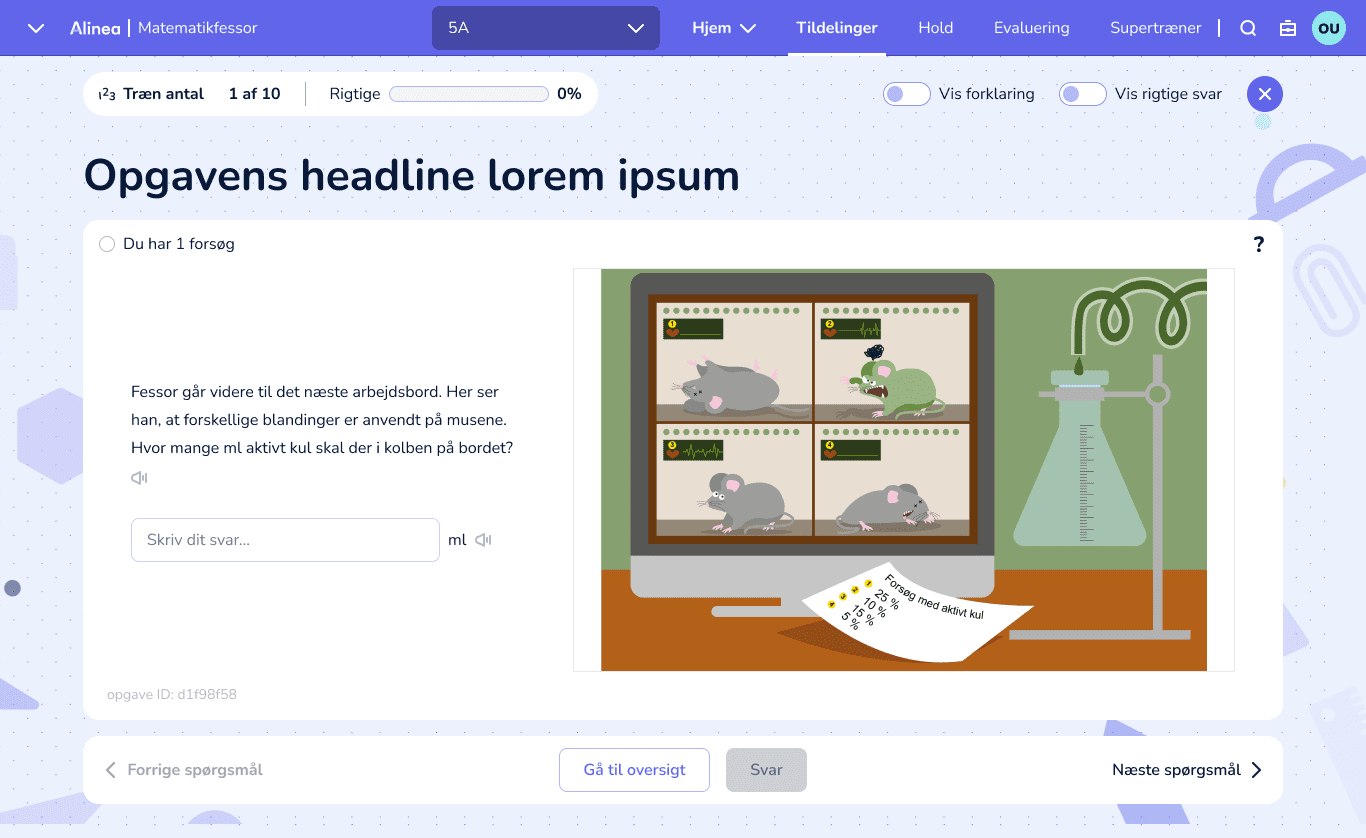
The Assignments and Training features are arguably the most important part of the platform, this is where teachers assign homework and students practice math. The preparation for beta had left the files in a disarray, why I took it on me to restructure and rebuild them from scratch, aligning layouts and components with our UI strategy and guidelines. Additionally, I wrote extensive documentation and flow maps, providing clear guidance for both the design and development teams. The Assignments module also received a much-needed design overhaul, improving its visual hierarchy and creating a more polished, user-friendly look.
The transformation called for close collaboration with the team, developers, and stakeholders to ensure alignment with project goals, resulting in a system that is visually cohesive, easy to maintain, and scalable for future growth.
Tools and methods
- Using insights from our “happy path” test to identify areas that call for a design overhaul.
- Rebuilding work files to consolidate all satellite files into a single project.
- Recreating all designs to match our UI kit, spacing, and layout guidelines.
- Creating comprehensive documentation and flow maps.
- Updating UX swimlanes based on team and stakeholder feedback.
- Ensuring the design files reflect our current concept and development environment.
Evaluation Design
(currently in development)
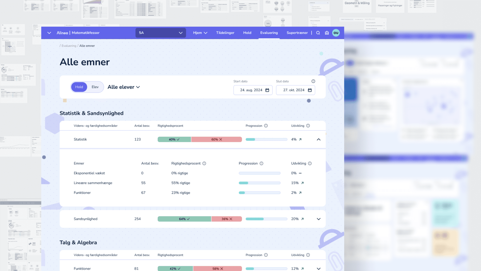
The ability to understand students performance and progression is essential for evaluating and identifying those who may need special attention, more challenging assignments, or how to make the best group matches. To ensure the platform would support teachers in the best way possible, our UX researcher mapped out the most important data points and insights needed for this overview. I joined the project as assistant UX and lead UI designer. Together, we developed a dashboard solution that provides teachers with a daily overview of the class and individual student progress, along with an option to dive deeper into the data if need be.
To ensure we were on the right path, we build a concept prototype and tested it with five teachers using a think-aloud interview methodology. It received very positive feedback, validating our design direction and confirming that it would meet teachers needs in their daily work.
From a UI perspective, as a team we initially explored a vibrant and energetic visual expression to inspire engagement. However, our user testing revealed that teachers used the evaluation system in diverse ways, making it important to avoid being prescriptive with the data. This insight led me to adopt a more traditional approach, prioritizing clarity and usability.
Tools and methods
- UX researcher used data mapping, development and stakeholder interviews to identify key insights.
- Close collaboration with our UX researcher.
- UI design workshops to kickstart the visual direction.
- Designing a high-definition concept prototype to be used for interviewing teachers.
- Using affinity mapping to cluster insights to help drive the UI design process.
- Internal testing of concepts and designs.
Creating comprehensive documentation and flow maps
Reflections
After twelve months of dedicated teamwork and strong collaborations, we successfully relaunched Matematikfessor.
The positive reception was evident through the minimal negative feedback we received from customer service. Throughout the project, we consistently developed and optimized features, maintaining a focused progression from start to finish. Our “happy path” tests confirmed that the platform was user-friendly and that our users enjoyed the new experience without encountering any critical challenges. Additionally, the midway test allowed us to effectively manage our development pipeline, identify requested features, and find time to incorporate them seamlessly.
On the practical side, reorganizing our Figma files and overhauling the UI kit made a significant difference in our daily workflow. Designers were able to collaborate better, work more efficiently and craft more consistent designs. Developers benefited from clearer documentation, allowing them to navigate features and project files more efficiently, prepare effectively for sprint planning, quickly spot potential challenges.
Overall, the redesign of Matematikfessor 2.0 not only provided users with a more polished, streamlined, and user-friendly product but also strengthened its competitive position in the market.
What would i do different
What would i do differently if given the opportunity to revisit the project:
- Conduct more user interviews as part of our ongoing validation for each feature we develop.
- Rethink how we utilize screen real estate to create a more application-like feel, especially for the training feature, which is the primary for students.
- Explore ways to better incorporate mobile functionality, creating an engaging approach to math training both at the couch and on the go.
- Advocate for a more brand-aligned design direction from gecco and refactor all designs before introducing new features.
- Complete the UI kit and project files overhaul before continuing design work, freeing up mental capacity during the project.
- Challenge the platform’s visual expression to achieve a more modern look and feel that caters to a broader spectrum of users, from kids and teenagers to teachers alike.
Final designs
