Case Guerbet
Re-design of Guerbet.com
Background
Guerbet is a company with a long history in the field of medical imaging and contrast agents, playing a key role in helping healthcare professionals make more accurate diagnoses and improve patient outcomes.
They serve a wide range of healthcare providers, patients, investors, and those interested in their pioneering research and development efforts. Working with Guerbet meant stepping into a space that is both forward-looking and deeply rooted in caring for people.
My contribution
- Lead art director on both the pitch and the final design
- Visual concept development
- UI design, digital brand guidelines and handover documentation for dev
- Transform business insights into viable design solutions
Challenges
Guerbet’s website was more of a traditional business card website. While the product sections attracted visitors, other areas, such as investor updates, research insights, educational content, and career and employee culture, did not receive the same level of attention. This imbalance suggested that many users primarily visited the site for product details, rather than engaging with the fuller narrative and depth of expertise that Guerbet wanted to share.
The visual design of the website felt outdated and not on par with their competitors. It was challenging for visitors to explore and connect with the content available on the platform, which led Guerbet to recognize the need for an in-depth content audit and a more thoughtful content strategy. They were looking for an approach that would elevate storytelling quality and create a more cohesive site with a well-thought-out flow. There was a desire to move beyond a product-centric site and instead create a space that reflected their industry knowledge, highlighted their commitment to employees and patients, and presented a cohesive picture of a company ready for the future.
Objectives
The objective was to get the new version of MF ready for launch by the new school year, This involved restructuring and polishing tKey objectives included creating a more balanced site structure, allowing visitors to easily find relevant information through well-crafted initiatives on the homepage and key section pages. The strategy and copywriting teams needed to conduct a comprehensive content audit, establishing a framework that supported clear, consistent storytelling and highlighted the company’s broader perspective. Working alongside the design team, these efforts aimed to present content in an engaging and coherent manner. Additionally, there was a need to update the visual design to meet current standards and expand the brand guide to include website-specific guidance, such as a UI kit and style guides.he UI kit to establish a more cohesive and scalable design system, as well as streamlining the design processes through an organized Figma workflow. Additionally, existing features needed refinement based on user testing, and new functionalities had to be developed to meet the expectations set by the legacy system.

Strategy and UX
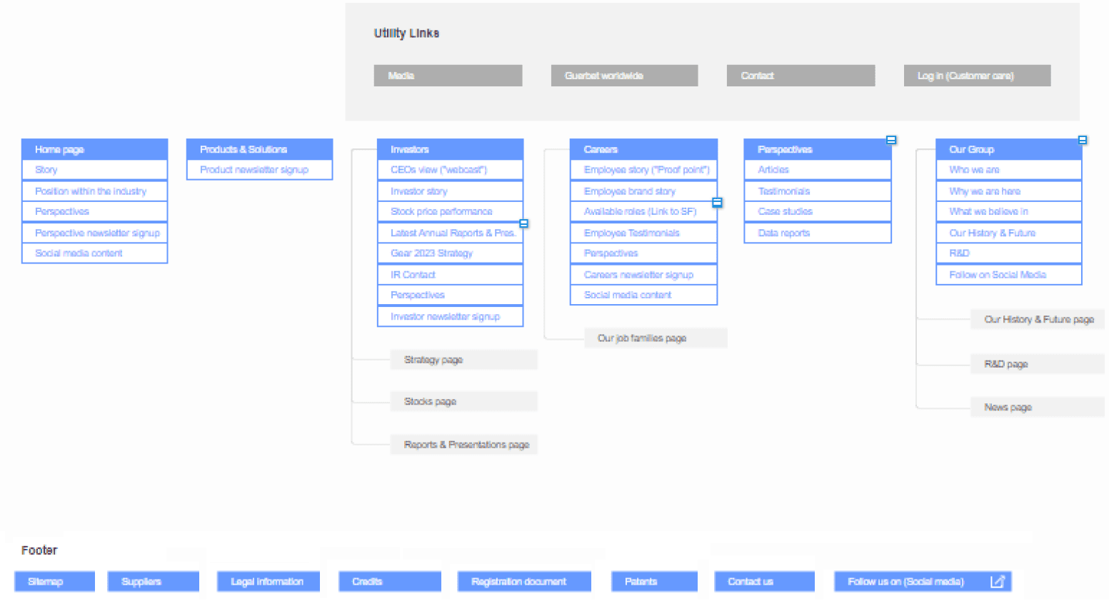
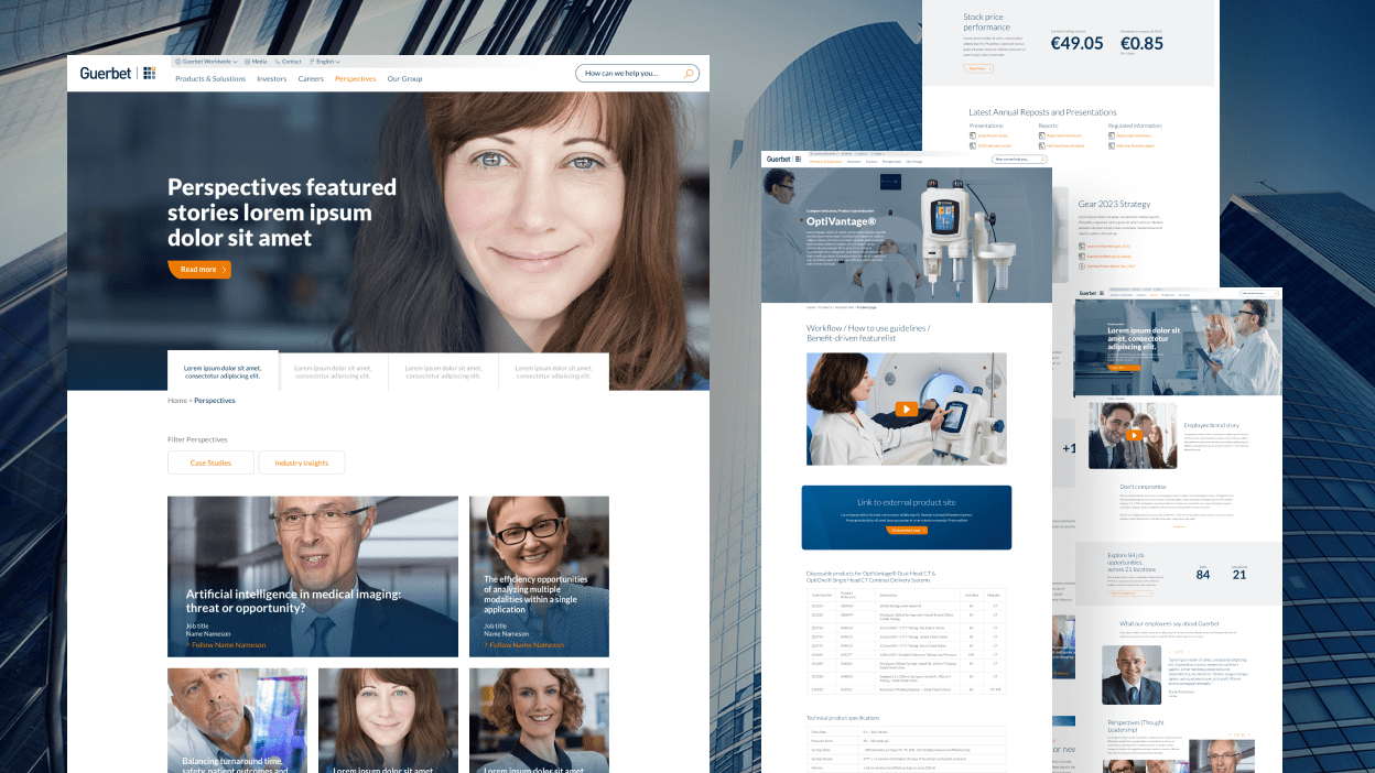
The UX and strategy teams began by leveraging Guerbet’s comprehensive research material including a competitor analysis and detailed personas to conduct a thorough content audit. They defined business goals focused on increasing traffic and retaining users, particularly targeting underperforming sections. By restructuring the information architecture, they developed a new site map and linking strategy to ensure a better flow on the platform. Collaborative wireframes and content presentation concepts were created to guide user flow and engagement. As the designer, I utilized these strategic insights and initial wireframes to develop a cohesive visual design, ensuring the website was both visually engaging and user-friendly.
Key areas of focus
Front page
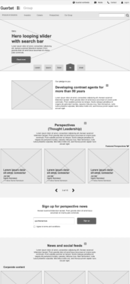
Introduces Guerbet’s heritage, innovation, and human perspective. Engages diverse visitors, encourages exploration, and highlights key stories, industry positioning, and thought leadership to build trust and understanding.

Product Solutions
Showcases product ecosystem, connecting offerings to broader solutions and insights. Guides experts and newcomers, highlighting coherence, relevance, and value beyond mere product listings.
Investors
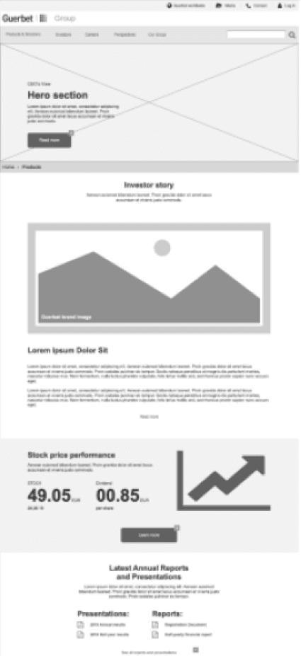
Conveys strategic vision, leadership perspectives, and future-focused growth. Builds trust by demonstrating Guerbet’s innovation, long-term stability, and market relevance as a compelling investment opportunity.
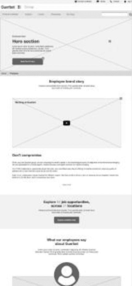
Careers
Highlights company culture, personal growth, and meaningful impact. Through stories and testimonials, invites talent to envision their place in a supportive, innovative workplace.
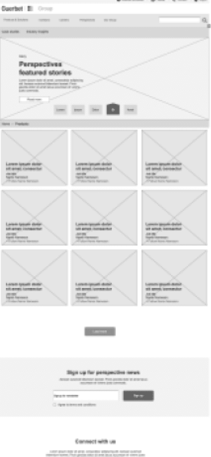
Perspectives
Central hub for thought leadership, articles, and case studies. Inspires curiosity, demonstrates expertise, and fosters knowledge-sharing that shapes future imaging and healthcare narratives.
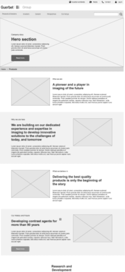
Our Group
Introduces Guerbet’s core identity, heritage, and beliefs. Showcases R&D, global reach, and cultural depth, revealing the human foundation and purpose behind the company’s innovation.
Design process
Visual concepts to identifying the appropriate design direction
In our pitch to Guerbet, we presented three distinct design concepts to determine the client’s preferred direction. This approach allowed us to assess where Guerbet felt most comfortable within the design spectrum. Once a preferred style was selected, we began developing the initial key layouts. A primary objective was to enhance the integration of the Guerbet brand within the design. To achieve this, we incorporated the nine-dot pattern and the curve as active design elements in the final layout. While the visual style was based on Guerbet’s brand guidelines, which primarily addressed analog production, significant exploration and adaptation were necessary to effectively transition these elements into a digital format.
The three design directions we explored were:
Conservative: This approach featured a traditional layout with a classic flow and visual structure, leaning towards a template-based design that emphasized reliability and familiarity.
Contemporary: Combining modern aesthetics with thoughtful content presentation, this concept blended traditional elements with a magazine-style layout to create a dynamic and engaging user experience.
Disruptive: This innovative approach reimagined content consumption by designing the homepage as a news feed, allowing users to quickly search and view information in a format similar to social media feeds.

Progressive Content Density for Enhanced User Experience
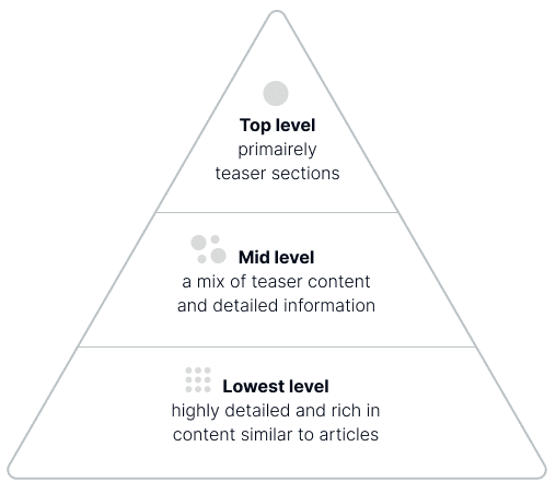
To maintain a natural progression of information, I implemented varying density templates that guide users to more detailed content as they navigate further into the website. The front page features easily digestible content with prominent images and clear, bold headlines, effectively capturing attention and introducing the content below. Moving to the mid layer, the site combines bite-sized modules in combination with more detailed information, enabling exploration while providing valuable insights. At the lowest level, article pages present streamlined, condensed text complemented by selected images and structured spacing, ensuring informative and easy readable content. This approach facilitates a natural, pyramid-like navigation and maintains visual appeal and user-friendliness as content expands, catering to both casual visitors and those seeking in-depth information.

Features catering for Guerbet’s content strategy
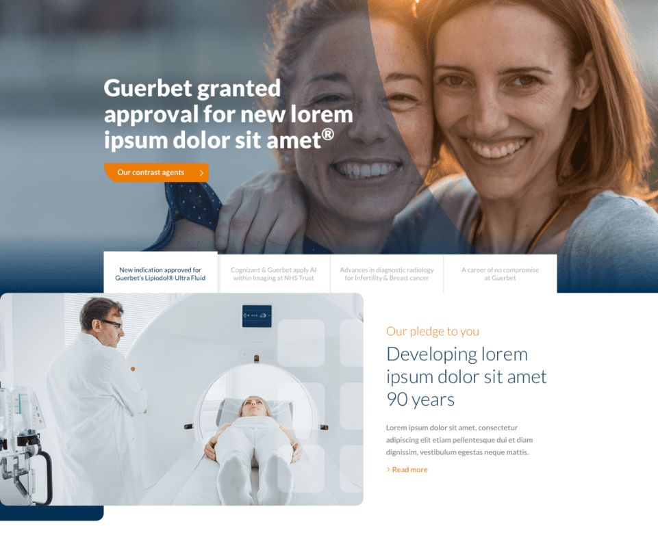
Hero module
Hero modules with story-driven navigation allow different departments to be highlighted equally and always visible. Juxtaposing heritage and innovation reinforces Guerbet’s role as an industry leader.
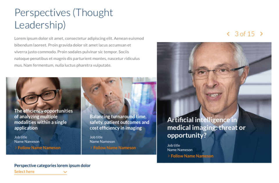
Thought Leadership Perspectives
The Perspectives module highlights insights from Guerbet’s leaders in a personal editorial styles, addressing key industry topics. This demonstrates Guerbet’s commitment to innovation and expertise.

SoMe integration
The SoMe module elevates social content to the same level as classic corporate content, mixing short and long-form content to cater to a broader audience.
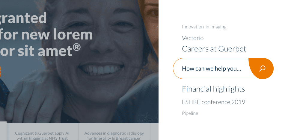
User-Centric Search
The Search module is stakeholder-focused and features suggestions based on intent, current page being visited and content popularity, allowing for quick access and an alternative navigation method for super-users.
Content Timeline
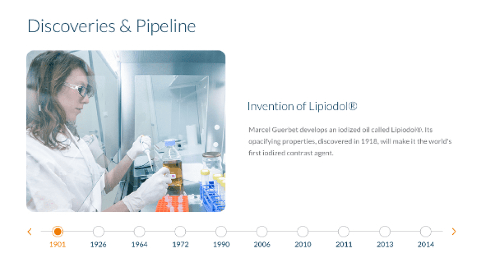
The Timeline feature allows editors to tell a timeline-based story with their content, great for insights such as history or levels of efficacy of a product. Users can scrub through the timeline to engage with the progression of information.
Visually Engaging Content
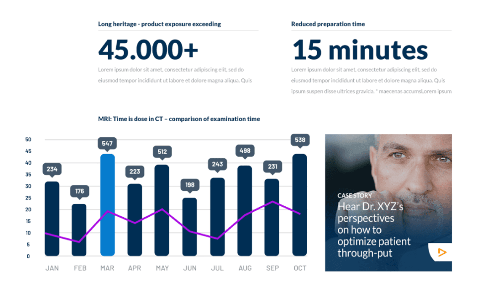
This method focuses on using illustrations and prominent text to highlight product benefits and insights. It appeals to visual learners and emphasizes real-world impacts.
Interactive Image Overlays
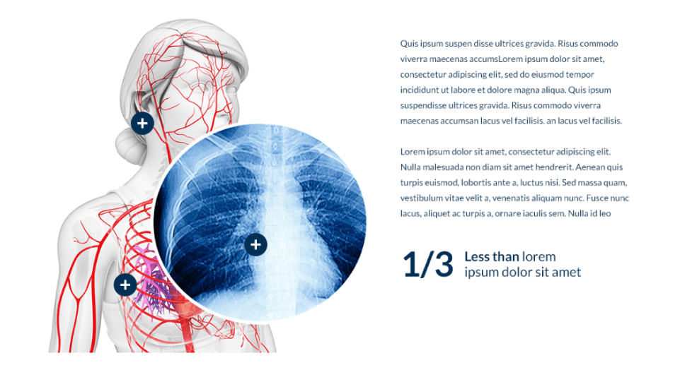
The interactive overlays module enables users to explore images through clickable hotspots. It clarifies complex information and enhances the visual learning experience.
Digital brand and style guide
Brand integration
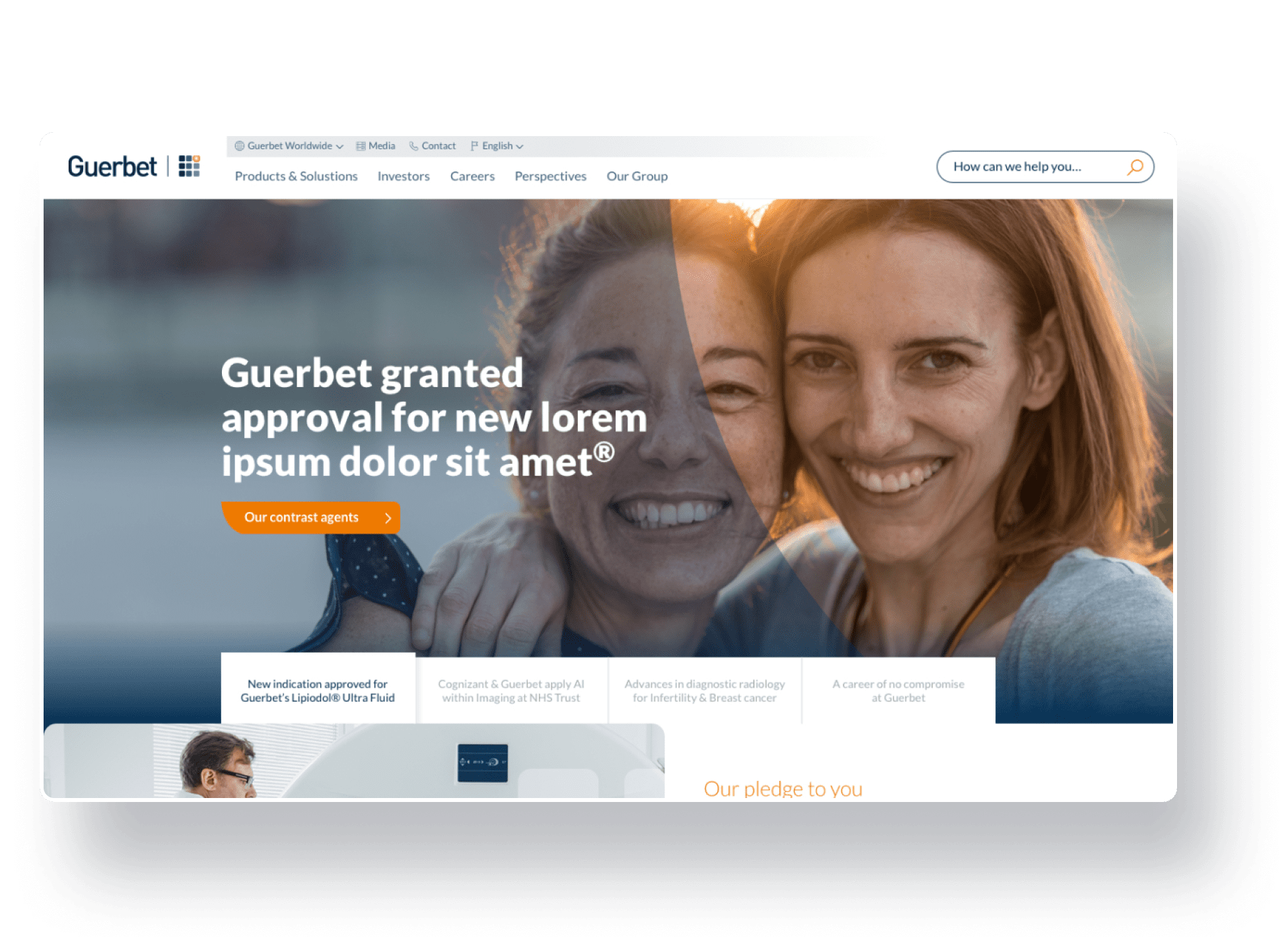
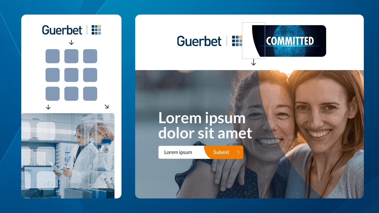
To address the need for better brand integration, I incorporated Guerbet’s 9-dot motif and the curve element from their CVI into overlays and UI elements. For hero sections, I introduced the curve as a transparent overlay to visually separate text from the underlying image, the negative space of the curve also helps with framing parts of the visual content below. The curve is also integrated into buttons, making them unique and memorable. Rounded corners were chosen to create a softer look while aligning with the roundness of the 9-dot motif. By using the 9-dot motif as a watermark on images, the site reinforces Guerbet’s identity without overwhelming the page. Through this considered integration of curves, watermarks, and rounded corners, the website adopts a cohesive and recognizable appearance that remains true to Guerbet’s established visual language.
UI-kit and style guide
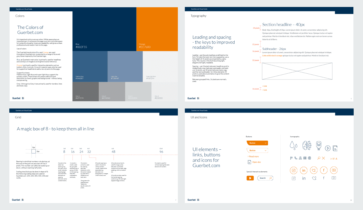
To establish a consistent and modern interface, I developed a comprehensive UI-kit and style guide outlining the use of Guerbet’s primary blue and orange colors as well as supportive neutral tones. Following an 8px grid, I defined clear spacing, margin, and padding values for headings, body text, and interactive elements. Each UI component was carefully documented with naming conventions and usage guidelines in collaboration with the dev team, enabling a smooth handover. This structured approach ensures a cohesive visual language that aligns with Guerbet’s updated identity and simplifies ongoing maintenance of the website.