Case HPV – Vores Valg
HPV awareness campaign for MSD
Background
Help combat misinformation about the HPV vaccine generated by the anti-vaccination community, MSD asked us to create an awareness campaign for young women, highlighting the safety and health benefits of getting the HPV vaccine, as well as drive traffic to the government-owned website “Stop HPV”, to help people in making a qualified decision.
My contribution
- Lead art director and UI designer.
- Core concept was initial outline by our creative director, from there on i continued developing the project in close collaboration with our strategy team to ensure alignment with relevant insights and valuable data points.
- Photography retouching and compositing
Creating a movement…
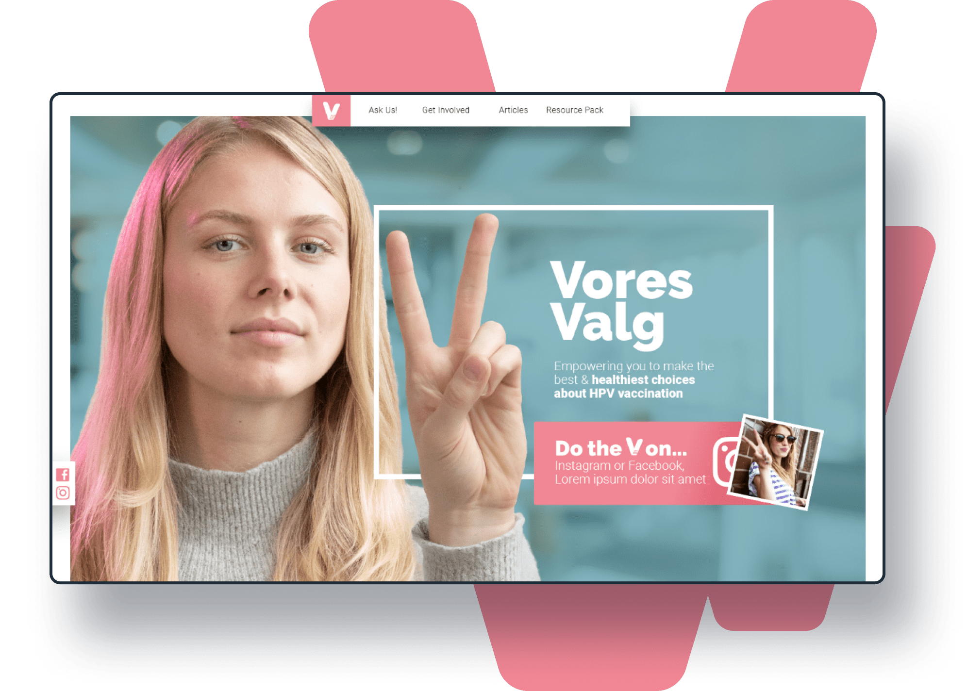
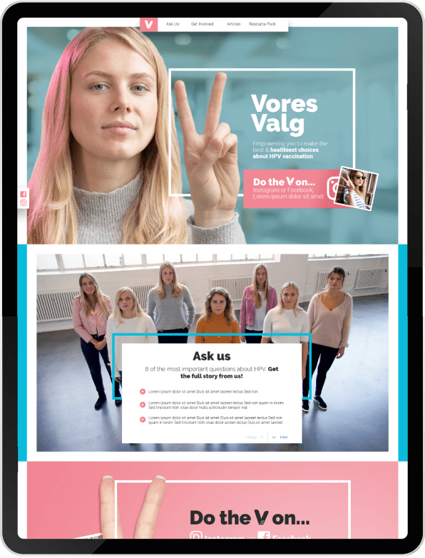
To empower young women to speak up about HPV vaccination, our campaign strategy focused on two main components – a social media movement and a campaign website. The movement was symbolized by the v-sign, which conveyed a positive gesture, easy to execute on social media with a subtle meaning “V for vaccine…”. We also created the tagline “Do the V…” and encouraged influencers to participate in spreading the message. The campaign website featured stories from young women who had already been vaccinated, giving them a voice and encouraging others to take a qualified decisions in their life.

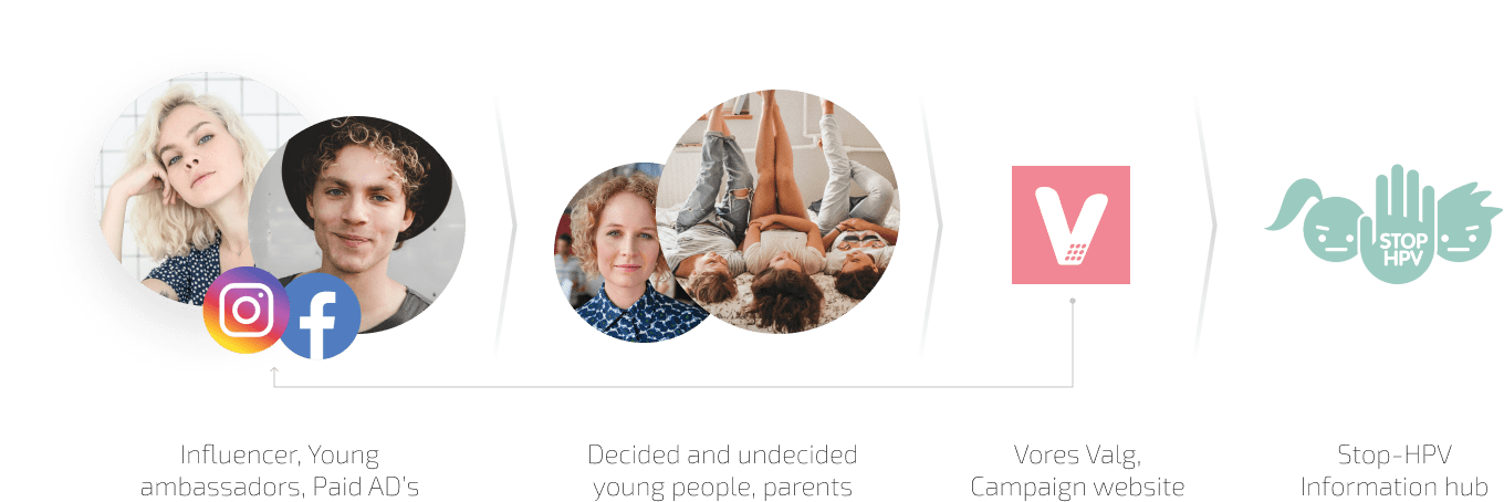
Traffic drivers
Basic overview on the channels and touch points involved in driving traffic to the government-owned website “Stop HPV”
Design
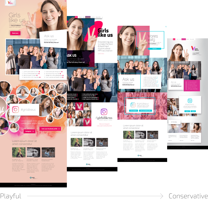
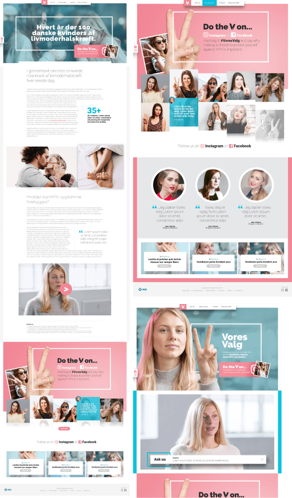
The design was aimed at a younger female audience while remaining approachable for a broad range of personas. To achieve this, we kept the style modern and contemporary, using a fresh color scheme of dusty pink and saturated blue for interactive elements. We added bold intertwined borders to frame and emphasize key messages, as well as overlapping elements to break the grid and create a more interesting flow.
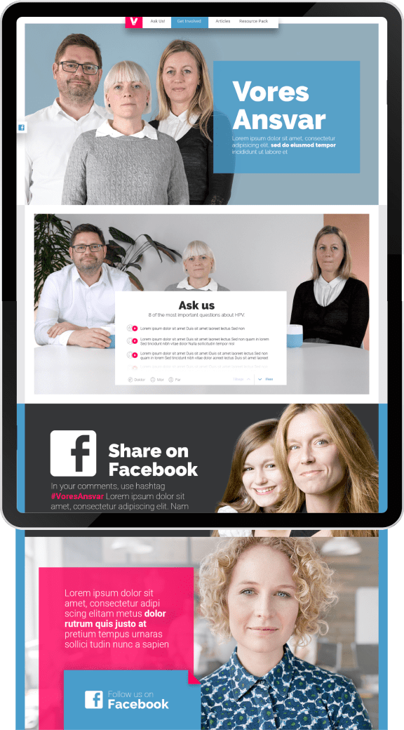
The website included a parent section, to convey a more conservative and serious expression, we opted for a mature and saturated pink, in conjunction with dusty blue.
The logo design is an abstract of the V-sign, flavored with the visual expression of a bandage, serving as a reference to a protective and safe vaccine.

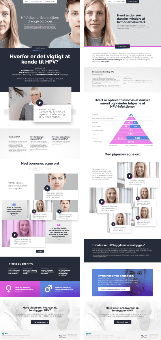
Design exploration to final design
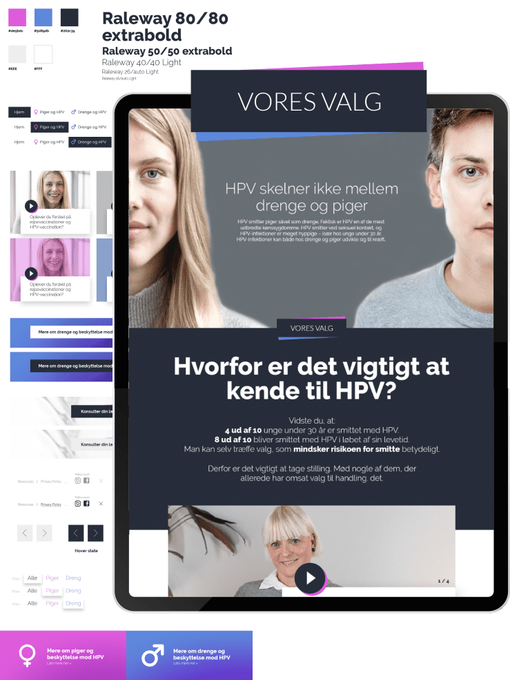
Adapting to scope change
As an experienced designer, you need to be able to deal with sudden changes in scope. This can be especially challenging in the healthcare industry, where there are many stakeholders and a strict compliance system in place. At Vores Valg, we faced a similar situation. In order to meet compliance, we had to remove the concept of using the V-sign, shift our social media concept to a more traditional marketing strategy that didn’t rely on influencers, and include boys in the campaign. This meant that dusty pink was no longer a desirable option and a new design and color scheme had to be created. Despite these changes, we were able to quickly adapt our concept while still achieving a strong design and successfully driving traffic to “stop HPV”.
