Case Roche
Web and internal CVI for Roche
Background
Doing my stay at Vertic i had the oppertunity to work with a lot of different type of projects for Roche
During my time at Vertic, I had the opportunity to work on a variety of projects for Roche. This case briefly covers some of the work I have done for Roche, spanning from designing public websites and marketing platforms to internal CVI development.
Overview of what this case contains: Website for NAVIFY Tumor Board application software, Website for TECENTRIQ immunotherapy cancer-fighting drug, CVI for Roche Global Access, Brand concept for Accu-Chek diabetes management
My contribution
- Digital Art Director and UI Designer
- Visual Designer executing strategies from our Creative Director
- Collaboration with the UX team
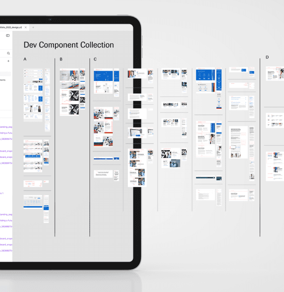
- Development of brand guidelines and handover documentation
- 3D Artwork
- Photography retouching and compositing
Digital platform for NAVIFY Tumor Board Solutions
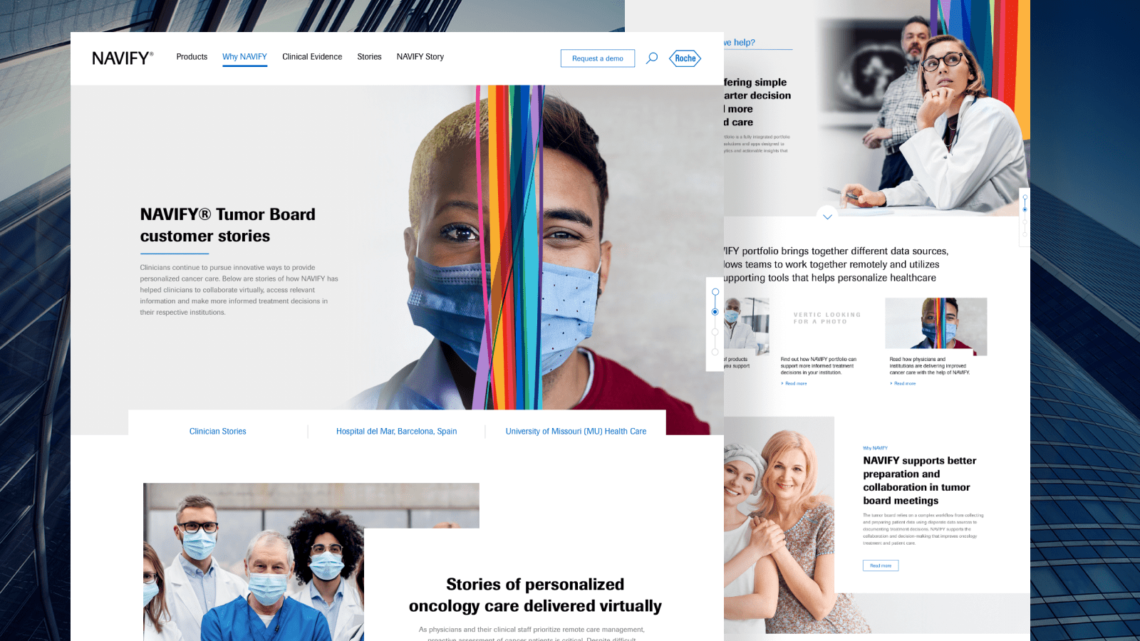
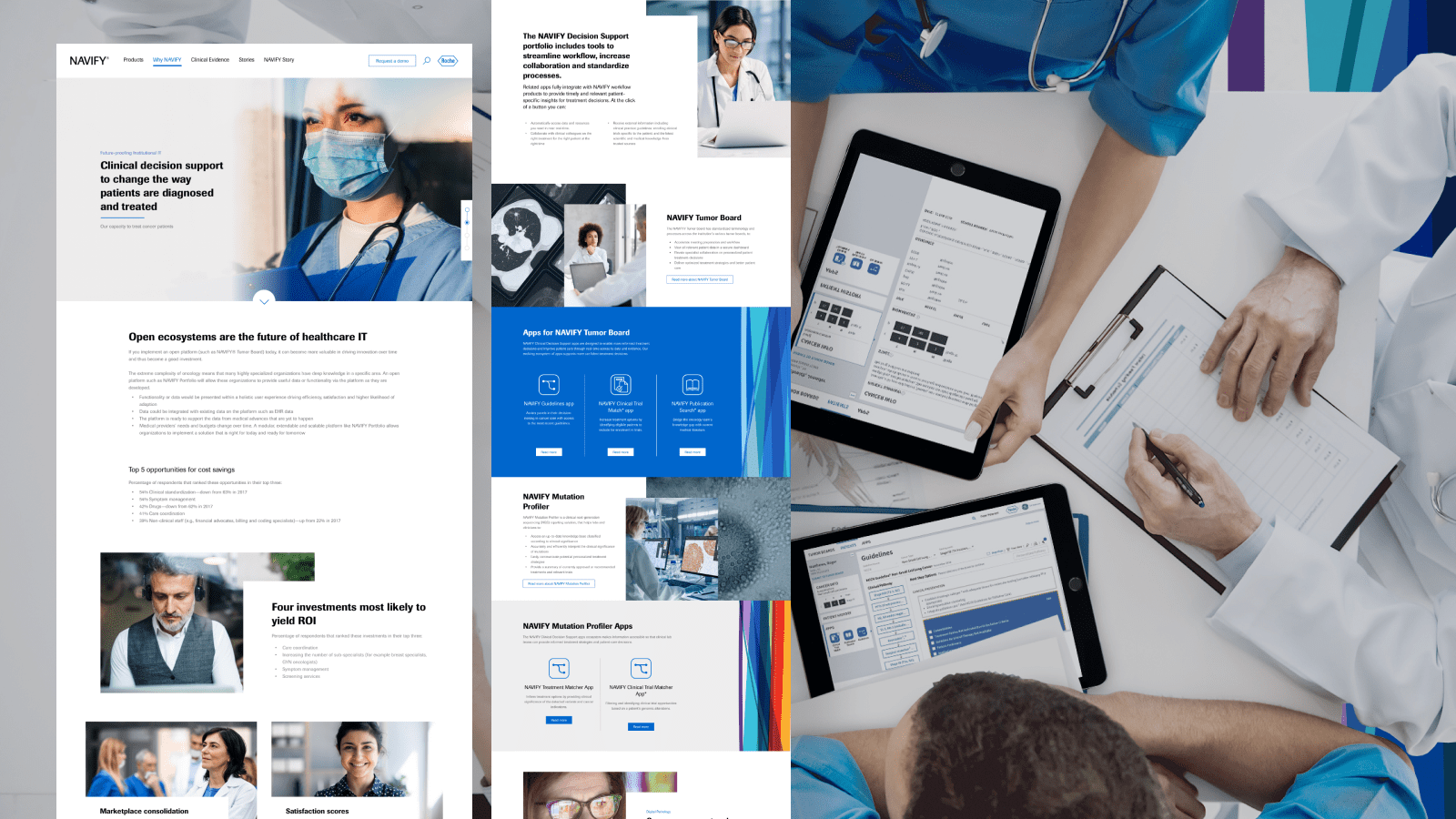
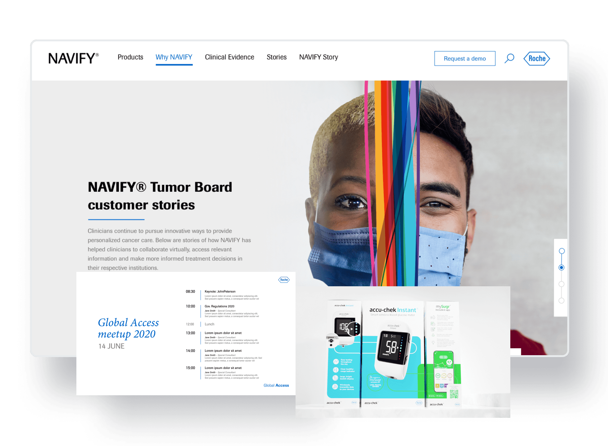
NAVIFY is a suite of digital healthcare solutions developed by Roche. It includes software like NAVIFY Tumor Board, which helps healthcare professionals streamline tumor board workflows and make informed treatment decisions for cancer patients. The NAVIFY website showcases these digital solutions, providing information about the products and their capabilities. It communicates the benefits of NAVIFY’s integrated approach to healthcare professionals, highlighting how the software can improve clinical decision-making, enhance operational efficiency, and support personalized patient care.
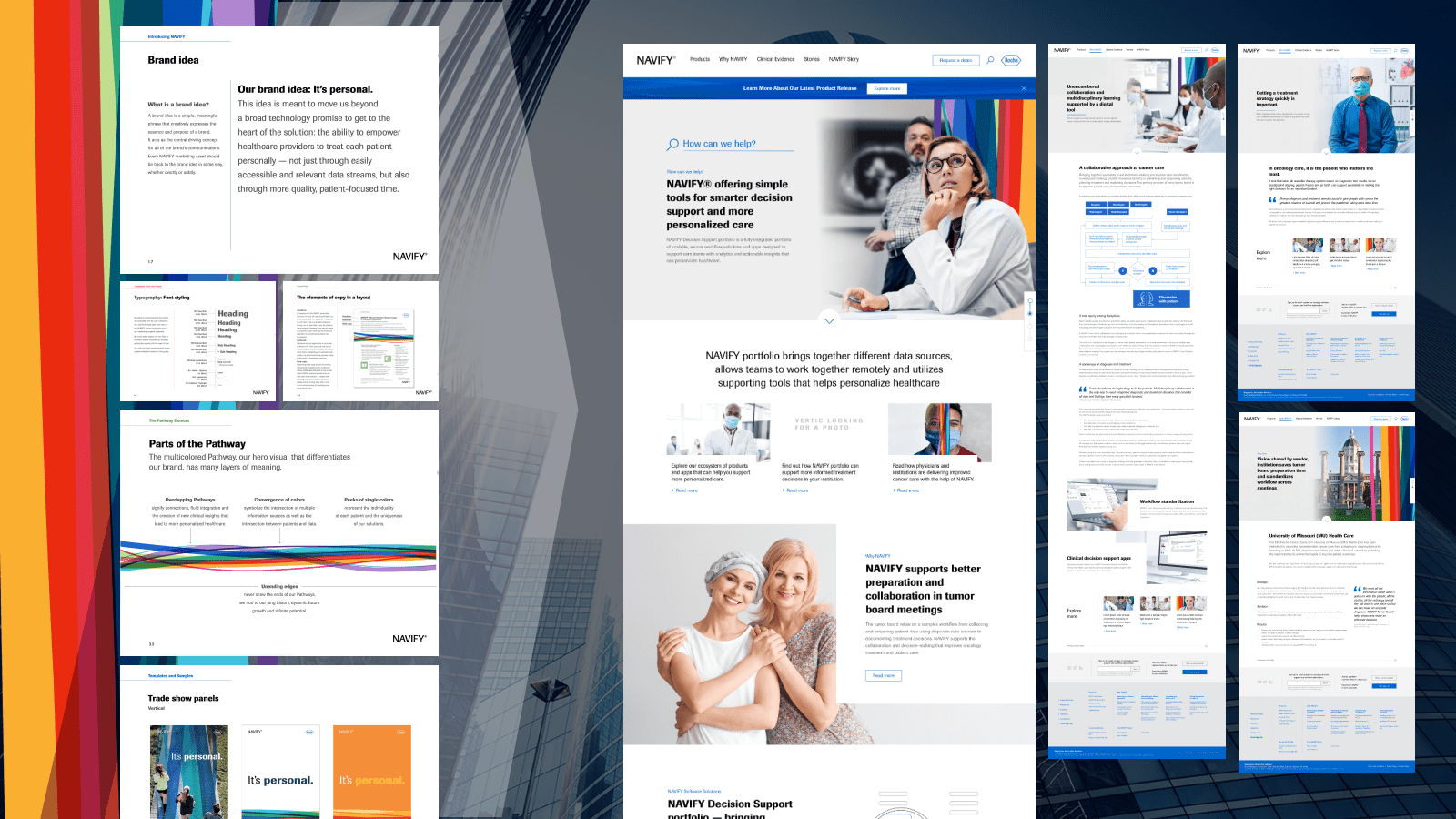
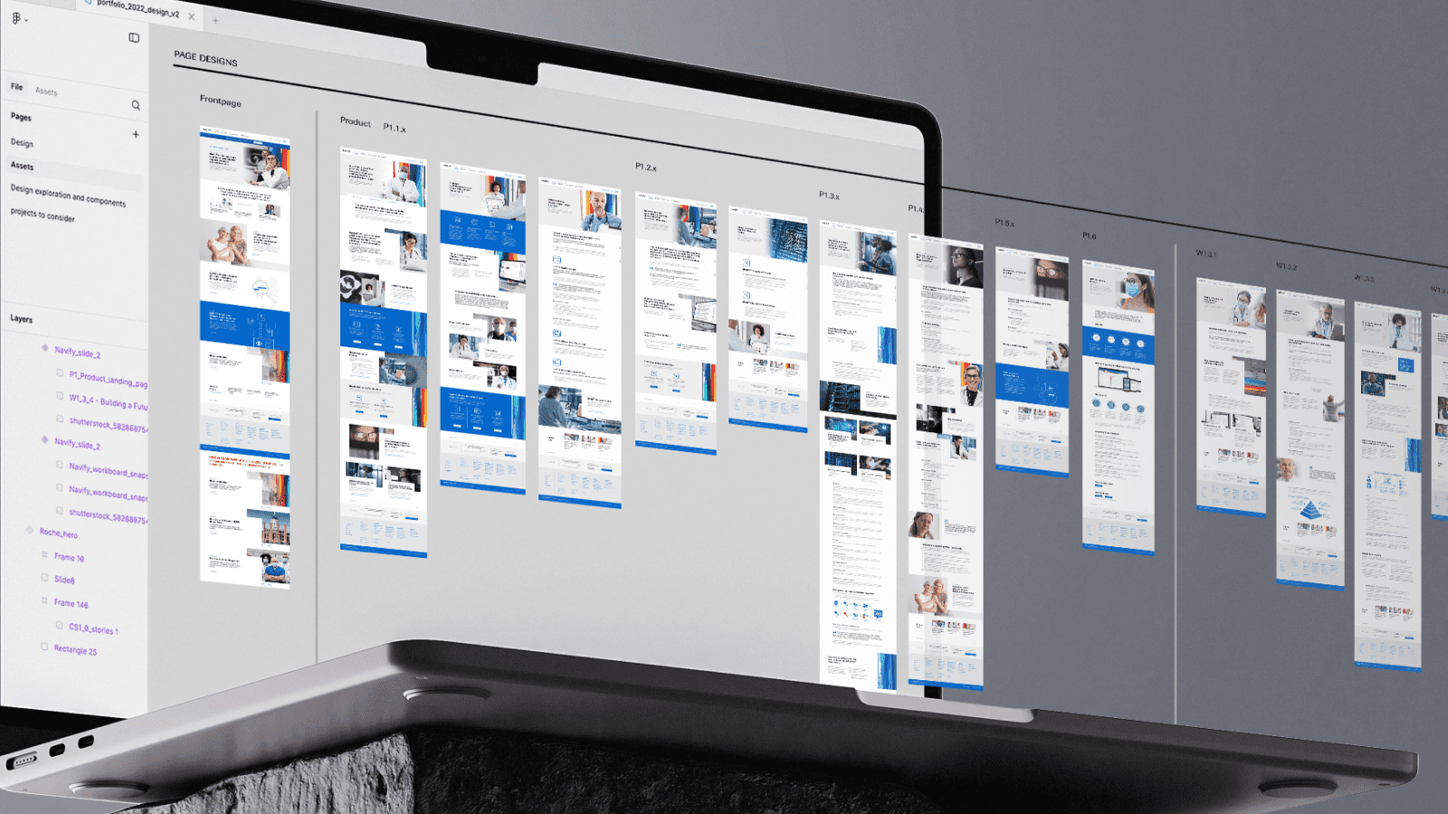
We were tasked to design the NAVIFY website, which included creating all pages with final images and copy while maintaining strong brand integration, with special attention to incorporating the NAVIFY path element. This led us to develop more than 32 content modules, enabling us to craft unique design layouts and cater to specific communication needs from the NAVIFY team
Digital Resource site for Tecentriq Cancer Care Solutions
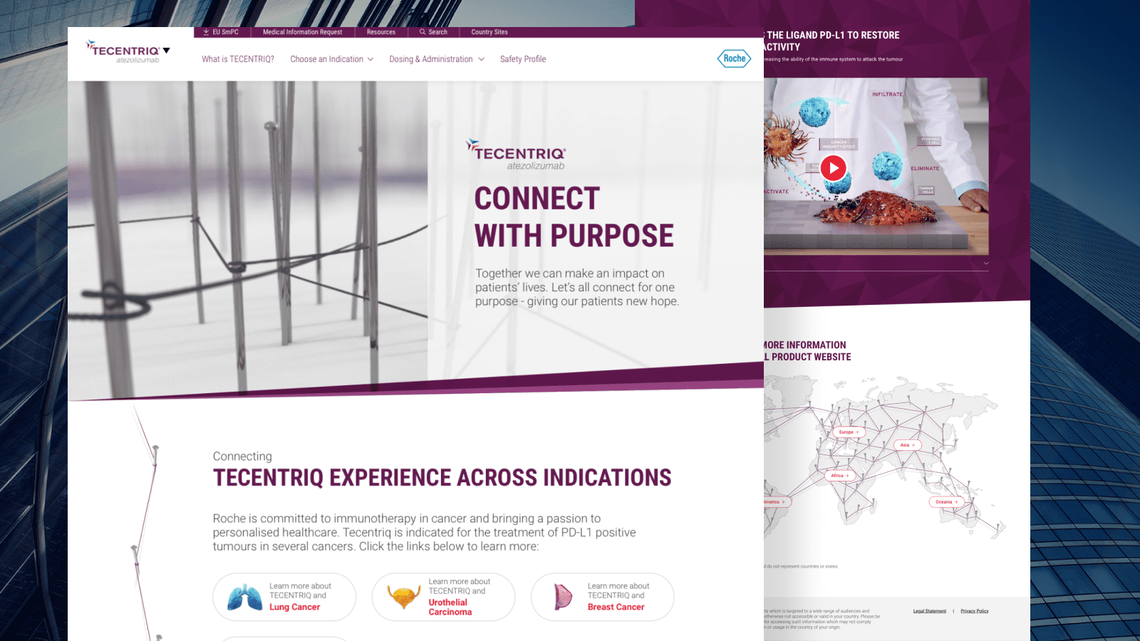
Tecentriq is a cancer treatment developed by Roche that helps the immune system recognize and attack cancer cells. It works by blocking a protein called PD-L1, which can prevent the immune system from identifying cancer cells as threats. By inhibiting this protein, Tecentriq reactivates the immune response, allowing the body to better fight against various types of cancer, including lung cancer.
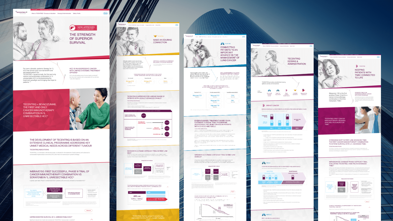
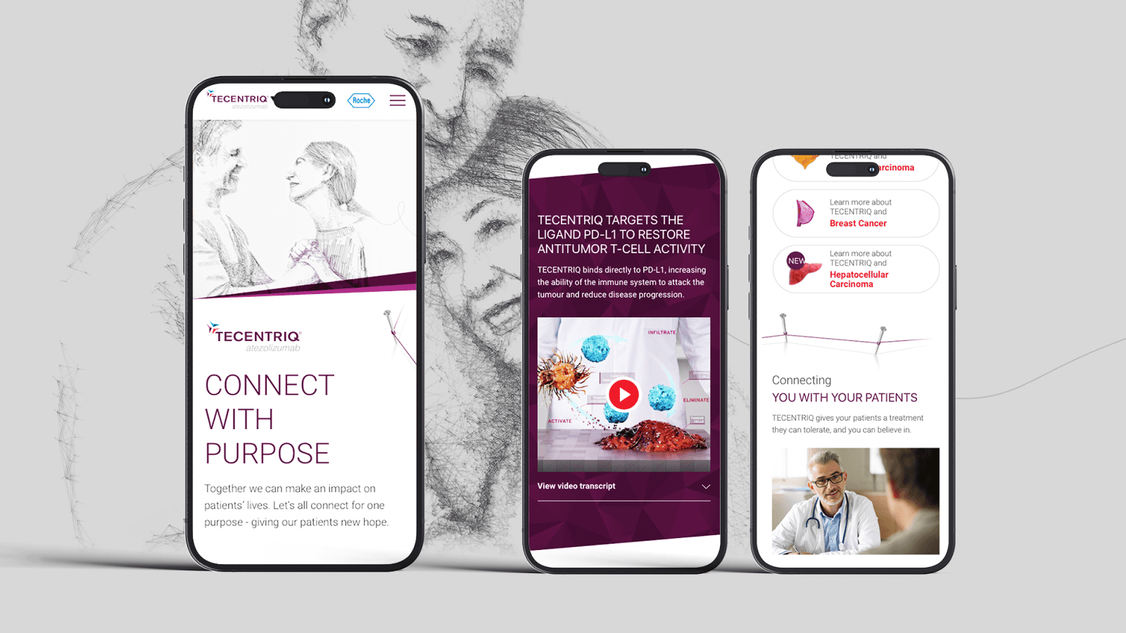
The Tecentriq website serves as an informative platform for patients and healthcare professionals, offering clear explanations of how the treatment works and what to expect. It aims to provide accessible information about the drug’s benefits and uses, helping users understand its role in cancer care.
We were tasked to design the Tecentriq website, building upon a previous concept centered around connecting lines. We incorporated these as strong brand elements throughout the site, aiming to create a more patient-friendly experience with engaging features and visual appeal.
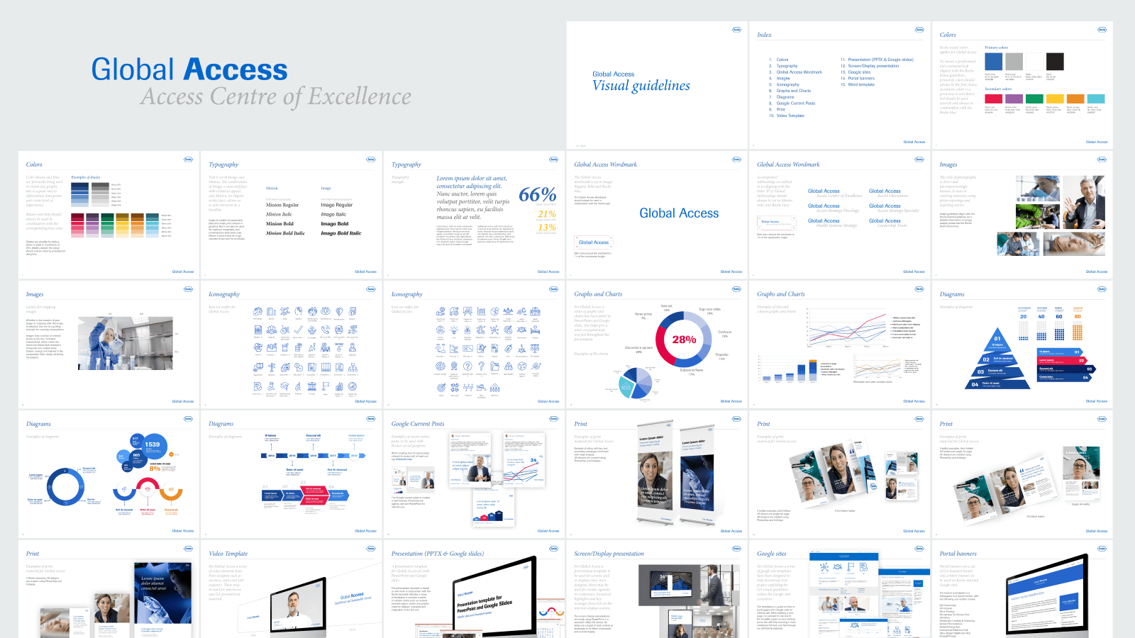
Designing a CVI and Digital Assets for Roche’s Global Access Team
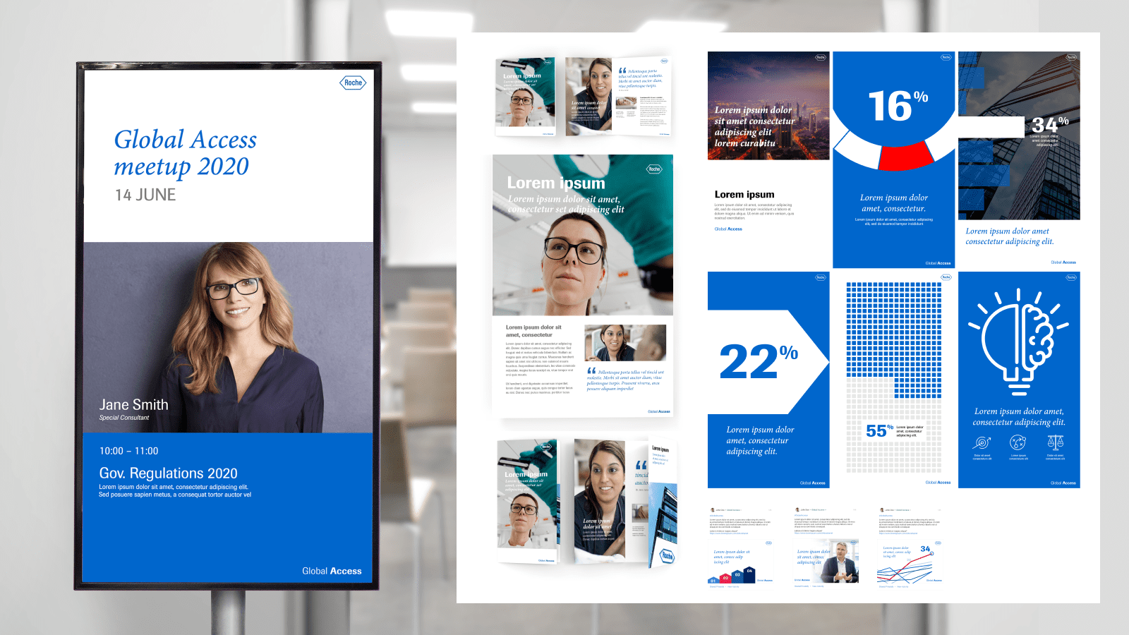
The Roche Global Access project involved developing a comprehensive visual identity (CVI) to enhance internal communication and engagement for a large scale department on an international scale. The objective was to create a cohesive design system aligned with Roche’s overarching brand guidelines while addressing the specific needs of the Global Access team.
The project deliverables included a range of physical and digital assets to support internal communication efforts. These encompassed templates for print materials such as flyers, leave-behinds, and rollups, as well as digital templates for social media engagement and intranet promotions. A robust icon pack, display designs for conferences and meetings, and branded intro/outro animations for video production were also created to ensure a consistent visual presence.
The CVI also included detailed brand guidelines tailored for non-design-oriented team members. These guidelines served as a practical resource, enabling the team to create on-brand materials independently.
The final outcome provided the Global Access team with a versatile and scalable design system, ensuring clarity, consistency, and ease of use across their internal and external-facing materials.
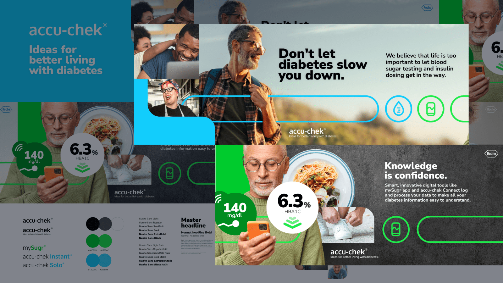
Reimagining Accu-Chek Through a Comprehensive Brand Concept
Accu-Chek, a Roche brand for diabetes management, empowers users to monitor and manage their condition without compromising their quality of life. For this project, we developed a visual brand concept to redefine Accu-Chek’s packaging and digital presence, focusing on the message: “ideas for better living with diabetes.”
The design introduced a pill-shaped outline to unify elements, vibrant blue tones to align with Accu-Chek’s identity, and green tones to represent the mySugr application. Deliverables included a brand strip showcasing key messages and visual elements, along with a style guide for consistent application.
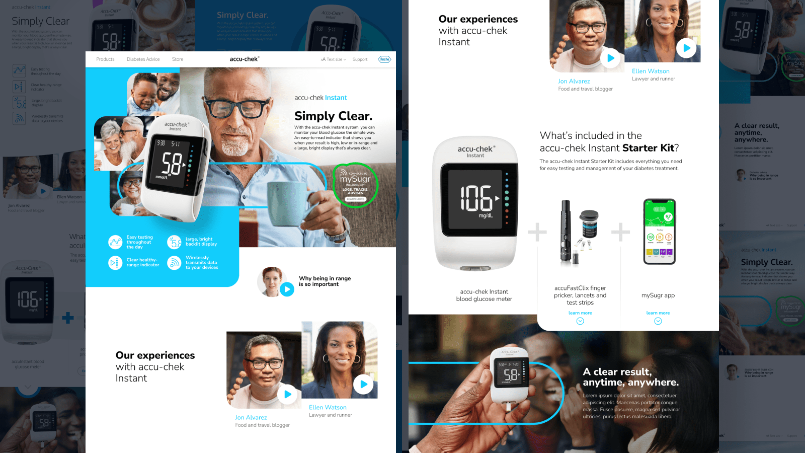
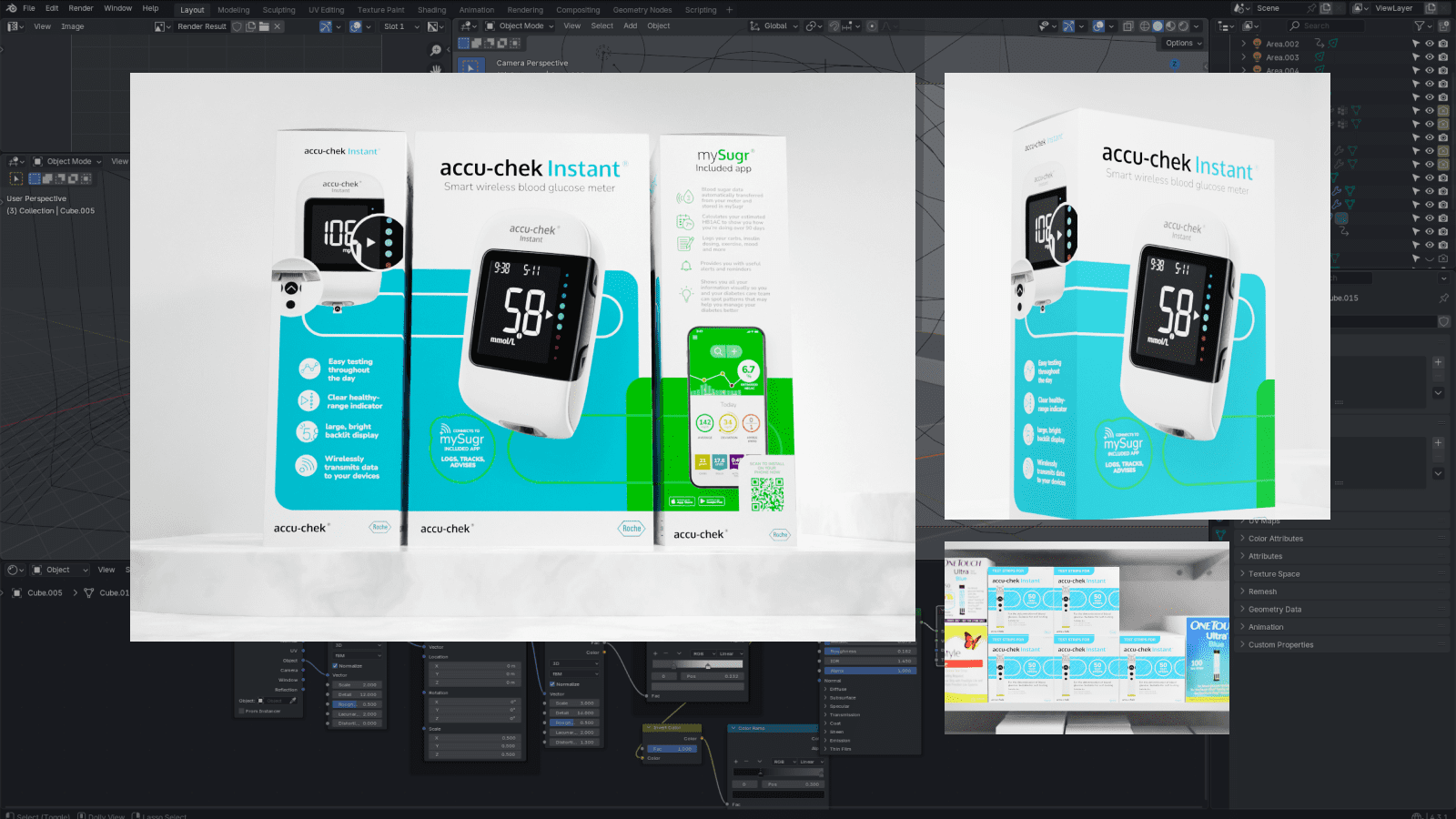
We also proposed a redesign of the Accu-Chek website and created 3D-rendered packaging concepts to visualize how the new designs would appear in real-life settings, all rooted in the cohesive brand concept.
